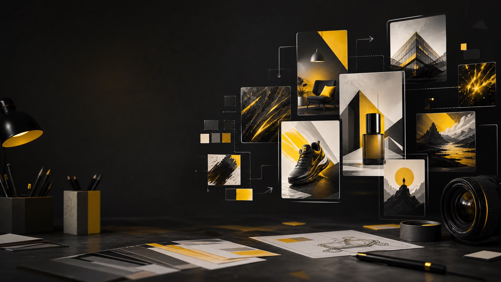
Prompt Library
12 safe Nano Banana prompt patterns
Use these patterns as starting points. Replace the bracketed details, then test one change at a time in Try Banana AI.
Pattern 1
Clean product hero shot
For store banners, product pages, and paid social drafts where the product must stay clear.
Clean studio product photo of [product], centered on [surface], soft diffused light from the left, subtle grounded shadow, realistic material texture, uncluttered background, premium commercial photography, 1:1 aspect ratio, no extra logos or unreadable labels.
It defines the asset type, subject, surface, light direction, material expectation, and brand-safety boundary.
Adapt with
- - surface: marble, wood, matte acrylic
- - lighting: morning, softbox, window light
- - aspect ratio: 1:1, 4:5, 16:9
Pattern 2
Lifestyle product scene
For contextual product visuals where the item needs a believable environment.
Lifestyle image of [product] used by an original everyday person in [setting], natural pose, product clearly visible, warm documentary lighting, shallow depth of field, realistic colors, calm commercial mood, no public-figure resemblance, no brand imitation, 4:5 aspect ratio.
It asks for a realistic use context while avoiding public-figure or trademark-style claims.
Adapt with
- - setting: kitchen, desk, gym bag, travel table
- - mood: cozy, premium, minimal, energetic
- - product visibility: front label, texture, scale
Pattern 3
Poster layout with readable text area
For event posters, launch cards, and campaign key visuals that need room for typography.
Editorial poster concept for [event/topic], bold visual metaphor featuring [main subject], large clean negative space at the top for a short headline, geometric layout, high contrast lighting, limited palette of [colors], print-inspired composition, 4:5 aspect ratio, no random text.
It separates visual generation from final typography and asks for a clear layout zone.
Adapt with
- - headline area: top, left, center
- - palette: orange/teal, black/cream, blue/lime
- - mood: serious, playful, cinematic
Pattern 4
YouTube thumbnail concept
For thumbnail drafts where the focal point and contrast matter more than fine detail.
YouTube thumbnail concept about [topic], one strong original subject in the foreground, expressive but natural pose, simplified background, high contrast color blocks, clear empty area for 3 to 5 words of text, dramatic rim light, sharp focus, 16:9 aspect ratio.
It makes the thumbnail readable at small sizes and avoids asking the model to invent long text.
Adapt with
- - foreground subject: object, creator silhouette, interface mockup
- - emotion: curious, urgent, calm
- - text area: left third, right third
Pattern 5
Original character concept
For avatars, mascots, game characters, and story concepts without copying protected characters.
Original character concept of [character role], three-quarter view, consistent outfit silhouette, distinctive but simple color palette, expressive face, clean background, soft studio lighting, concept art sheet feel, no copyrighted character imitation, no real-person resemblance.
It asks for originality, stable design anchors, and safe identity boundaries.
Adapt with
- - role: courier, botanist, space mechanic, cafe owner
- - palette: two main colors plus accent
- - style: polished concept art, soft 3D, editorial illustration
Pattern 6
Consistent character variation
For making a second scene from an original character draft while keeping identity cues.
Using the same original character design cues: [hair/clothing/colors/accessory], create a new scene in [environment]. Keep the face shape, outfit silhouette, and palette consistent. Change only the pose and background mood. Clean composition, soft light, no extra characters.
It tells the model which identity cues matter and limits the edit scope.
Adapt with
- - environment: city balcony, studio desk, forest path
- - pose: walking, reading, presenting
- - mood: calm, bright, mysterious
Pattern 7
Reference-image product edit
For image-to-image edits where you want to keep the product but change the scene.
Use the reference image as the source. Keep the product shape, camera angle, and key label placement unchanged. Replace the background with [new setting], improve lighting to [lighting style], keep materials realistic, preserve readable details, no added logos, no extra products.
It gives a clear keep/change instruction, which is the heart of controlled edits.
Adapt with
- - setting: clean studio, outdoor table, holiday shelf
- - lighting: softbox, golden hour, cool tech glow
- - constraints: keep crop, keep color, keep label
Pattern 8
Social ad creative
For safe ad-style visuals without pretending to produce a full campaign system.
Social ad visual for [product or offer], main subject on the right, clean benefit-focused scene on the left, modern commercial lighting, strong but not cluttered contrast, space for short copy and callout badge, realistic textures, brand-safe generic design, 4:5 aspect ratio.
It creates an ad-ready composition while leaving final copy and compliance review to the creator.
Adapt with
- - layout: subject right, centered, diagonal split
- - benefit scene: speed, comfort, durability
- - platform crop: 1:1, 4:5, 9:16
Pattern 9
App or SaaS hero visual
For web hero backgrounds and launch visuals that should feel modern but not like fake UI proof.
Modern SaaS hero visual for [product category], abstract interface-inspired shapes, soft depth, clean workspace atmosphere, no fake readable dashboard claims, no specific third-party logos, balanced negative space for headline, crisp lighting, 16:9 aspect ratio.
It avoids fabricated UI evidence while still creating a useful hero-style visual.
Adapt with
- - category: analytics, writing, planning, finance
- - shape language: cards, flowing panels, subtle grids
- - mood: calm, precise, energetic
Pattern 10
Editorial concept image
For blog covers, newsletter cards, and explainer images.
Editorial illustration for an article about [idea], visual metaphor using [object or scene], clean composition, restrained palette, thoughtful lighting, magazine cover quality, no text, no real-person likeness, enough negative space for a headline overlay, 16:9 aspect ratio.
It focuses on concept and composition while keeping text and identity risks out of the image.
Adapt with
- - metaphor: bridge, compass, stacked papers, glowing map
- - palette: muted green, deep blue, warm neutral
- - space: top, center, left
Pattern 11
Wallpaper or background
For phone, desktop, and social backgrounds where clarity and mood are more important than complex subjects.
High-quality wallpaper background inspired by [mood/theme], layered depth, soft gradients from real lighting, subtle texture, no text, no logos, no faces, clean focal flow, suitable for icons and widgets, [aspect ratio].
It keeps the image usable as a background and avoids busy details that fight the interface.
Adapt with
- - theme: sunrise glass, quiet forest, neon rain, paper craft
- - aspect ratio: 9:16, 16:9, 1:1
- - texture: film grain, soft paper, polished glass
Pattern 12
Before-after edit instruction
For refining a draft without losing the part that already works.
Edit the current draft. Keep [elements to preserve] exactly as they are. Improve [specific issue] by changing [one variable]. Do not change the camera angle, main subject, or overall layout. Make the result cleaner, more realistic, and ready for [use case].
It prevents over-editing by separating preserved elements from the single change request.
Adapt with
- - preserve: subject, crop, palette, pose
- - issue: messy background, weak lighting, low contrast
- - use case: product page, poster, thumbnail, wallpaper